When a startup launches, founders often grab a logo, a landing page, a pricing table and a single social‑media channel in a rush. Those choices feel right at the moment but are made in isolation. A splash‑page brand can clash with a product that uses a different tone, and a desktop‑optimised site may break on the phone your customers use. The result is a patchwork of assets that becomes harder to manage as the business grows.
The friction shows up in three ways. First, duplicated effort: teams spend time recreating a logo for a new deck because the original file was never saved in a shared system. Second, founder fatigue: every new feature or channel feels like a fresh decision, and without a clear framework each tweak turns into a mini‑project. Third, hidden cost: the time spent fixing misaligned assets could be used to build the next product or engage customers.
Founders need a simple framework that turns early choices into a coherent foundation. The approach described here is not a major brand or website revamp; it is a routine that fits into the first months of a venture. By auditing what already exists, weighing options against a clear matrix, documenting the outcomes, and reviewing them, founders can establish strong foundations across brand, web, growth, product and systems.
Understanding the cost of fragmented decisions explains why a structured approach matters for long‑term growth.
A practical first step is to map your customer touchpoints. Customer journey map before launch provides a ready‑to‑use template that surfaces gaps early.
When every asset aligns with a shared vision, the time you spend on design and development is spent on delivering value.
Main explanation
When a startup launches, founders often decide on a logo, a landing page, a pricing model and a social‑media channel quickly. Those choices feel urgent, but they also determine the shape of everything that comes after. If they are made without a clear plan, they can create a tangle of exceptions that slows new features, marketing campaigns and hand‑offs.
A lightweight decision process can give those early choices a clear shape before they become entrenched. It isn’t a heavy framework that forces a brand book or a CMS overhaul immediately. Instead, it is a four‑step cycle that founders can finish in a few weeks and that keeps the business flexible.
The cycle starts with an audit that shows what already exists and where gaps remain. It then uses a decision matrix to turn subjective preferences into a clear comparison. After that, documentation records the outcomes in a shared place. Finally, a review loop lets the process adapt as the business grows.
Because the audit is the foundation, spend a day mapping every touchpoint a customer might encounter. Include brand assets, website pages, growth channels, product features and internal tools. A basic customer journey map can reveal where a user moves from a website form to a spreadsheet in the back‑office, highlighting a missing integration or duplicate data entry. A ready‑to‑use template can help founders adapt this to their own situation.
After the audit, the decision matrix lets founders weigh options. They might ask whether a branding choice makes the product easier to explain or whether it costs too much time to implement. By assigning a weight to each criterion – clarity, scalability, cost, speed – the matrix turns a gut feeling into a visible trade‑off. The matrix can live in a shared spreadsheet or document that the team updates as new information arrives.
Documentation follows. It is a living record that captures why each choice was made. Storing the matrix and its outcomes in a version‑controlled place – a shared Google Sheet or a simple project board – lets new team members understand why a colour palette was chosen or why a landing page follows a particular layout. This shared knowledge stops first‑time‑only decisions from becoming friction points as the team expands.
Embedding the decisions into everyday workflows makes the process useful. For visual consistency, a brand guidelines document can enforce the rules that emerged from the audit and matrix. A simple set of rules keeps a logo, colour palette and tone of voice aligned across a website, a pitch deck and a product page.
On the web, a modular design system keeps the site flexible. By organising components into reusable blocks, a founder can add new pages or features without re‑working the whole layout. This structure makes future changes predictable and low risk.
Storytelling ties brand, product and growth together. A concise framework helps founders articulate the core problem, the solution and the impact, and then copy that narrative across marketing copy, sales scripts and product descriptions. The pattern keeps the brand voice consistent even as new features appear.
The review loop is the safety net. At the end of each sprint or product release, the team revisits the matrix and documentation to confirm that the decisions still hold. If a new market segment emerges or a competitor introduces a similar feature, the loop lets the founder adjust the foundation without breaking the whole system.
When the business scales, the same simple process can handle new product lines, more team members and new markets. Because the audit, matrix, documentation and review loop form a single, repeatable cycle, adding a feature or launching in a new country is just another iteration of the same steps.
In practice, the first win is a clean audit that uncovers hidden redundancies. The next win is a decision matrix that turns a vague preference into a clear choice. The final win is a documented rationale that future hires can read and understand without a lengthy onboarding period.
Founders who adopt this approach spend less time arguing over design details and more time delivering value. The process also signals to investors and partners that the business has a deliberate, scalable foundation.
Founders often make quick, isolated choices. The real task is linking those choices to a common purpose so they can grow together. A practical decision‑making system is less a rigid framework and more a routine that surfaces the right questions at the right time.
1. Keep the audit focused but complete
Begin by noting the assets you already own – brand assets, website pages, growth channels, product features, tools and processes. You don’t have to inventory every file; instead, chart the touchpoints that customers and your team interact with. A customer journey map before launch can expose gaps and contradictions without getting lost in detail.
2. Use a simple, weighted matrix
When you have to pick between options – say a new product feature or a homepage redesign – look at four factors: clarity, scalability, cost and speed. Give each factor a weight that reflects your current priorities, then score each option. The resulting table shows trade‑offs at a glance and keeps the discussion objective. Keep the matrix in a shared, version‑controlled space so the reasoning stays with the decision.
3. Anchor decisions in a brand system
Visual and verbal rules keep a brand cohesive. Once you finish the decision matrix, translate the outcomes into a brand system foundation. That way any logo tweak, colour change or copy edit is checked against consistent guidelines, preventing drift that would otherwise trigger a redesign.
4. Embed outcomes into everyday workflows
Guidelines, templates and handover documents are useful only when they live inside the tools your team uses. A design‑system‑based website architecture keeps the site modular, letting you add new pages or features without re‑working the whole structure. Pair this with a regular review loop – for instance, a monthly sprint review – to capture feedback and tweak the system before it becomes entrenched.
5. Scale the system, not the decisions
As the business grows, the decision‑making system should evolve. When you add a new product line or enter a new market, revisit the audit and matrix. Storytelling frameworks can help keep the brand voice consistent across new offerings, and a design‑system‑based approach can speed up the next phase of site expansion without breaking established patterns.
In short, a practical decision‑making system is a routine that keeps early choices aligned, documented and ready to grow. By auditing, scoring, anchoring and embedding, founders can avoid costly rework that arises from fragmented decisions.
Every decision a founder takes becomes a thread that weaves through all future interactions. Our framework is deliberately simple, so it can be introduced early without turning the business into bureaucracy.
The first step is an audit that captures what is already in place and where gaps lie. That audit feeds into a decision matrix that turns the gaps into options, each scored against the four criteria that matter most early on: clarity, scalability, cost and speed.
The result is recorded in a shared, version‑controlled space, allowing the next team member to pick up the thread without reinventing it.
Embedding the decisions into everyday workflows – via clear guidelines, reusable templates and regular check‑ins – keeps the system alive. When a new feature or market is added, the audit‑matrix‑document cycle can be repeated, preventing a pile‑up of ad‑hoc fixes.
The system is built to grow. A brand system keeps visual and verbal rules aligned, while a design system for the website lets the site expand without a full redesign. A consistent brand voice can be reused across channels, cutting the friction of rewriting the narrative each time.
When you feel ready to move forward, you might bring in a partner who can help turn a prototype into a production‑ready site that reflects the decisions you’ve already made.
If you want to ensure that early choices set a clear path forward, we can help you build a system that stays useful and grows with you.
When a website becomes a temporary solution: recognising the signs and fixing them
It can feel convenient to launch a site that looks good and gets traffic, but if the design was a quick fix, the hidden cost starts to show. A website that was built to fill a gap can become a source of friction for both visitors and the team that maintains it.
1. The first sign: the page layout feels like a patch
When you look at the main pages, you might notice that the layout was assembled from a handful of components that were copied from elsewhere. The spacing is uneven, the colour palette jumps between sections, and the typography changes mid‑paragraph. These are the visual clues that the site was assembled quickly rather than designed with a coherent system.
2. Content that repeats itself in different places
If the same copy appears on the homepage, a product page and a blog post, it suggests that the content was duplicated to save time. This repetition can confuse visitors and makes it harder for the team to keep the message consistent. A clear content strategy would have defined where each piece of information belongs and how it should be phrased for each audience.
3. Forms that ask for the wrong data
When a contact form asks for details that the business never uses, or when it misses key fields that the sales team needs, the form becomes a bottleneck. A temporary solution often uses a generic form template that was not customised to the workflow. The result is a backlog of incomplete enquiries and wasted follow‑up time.
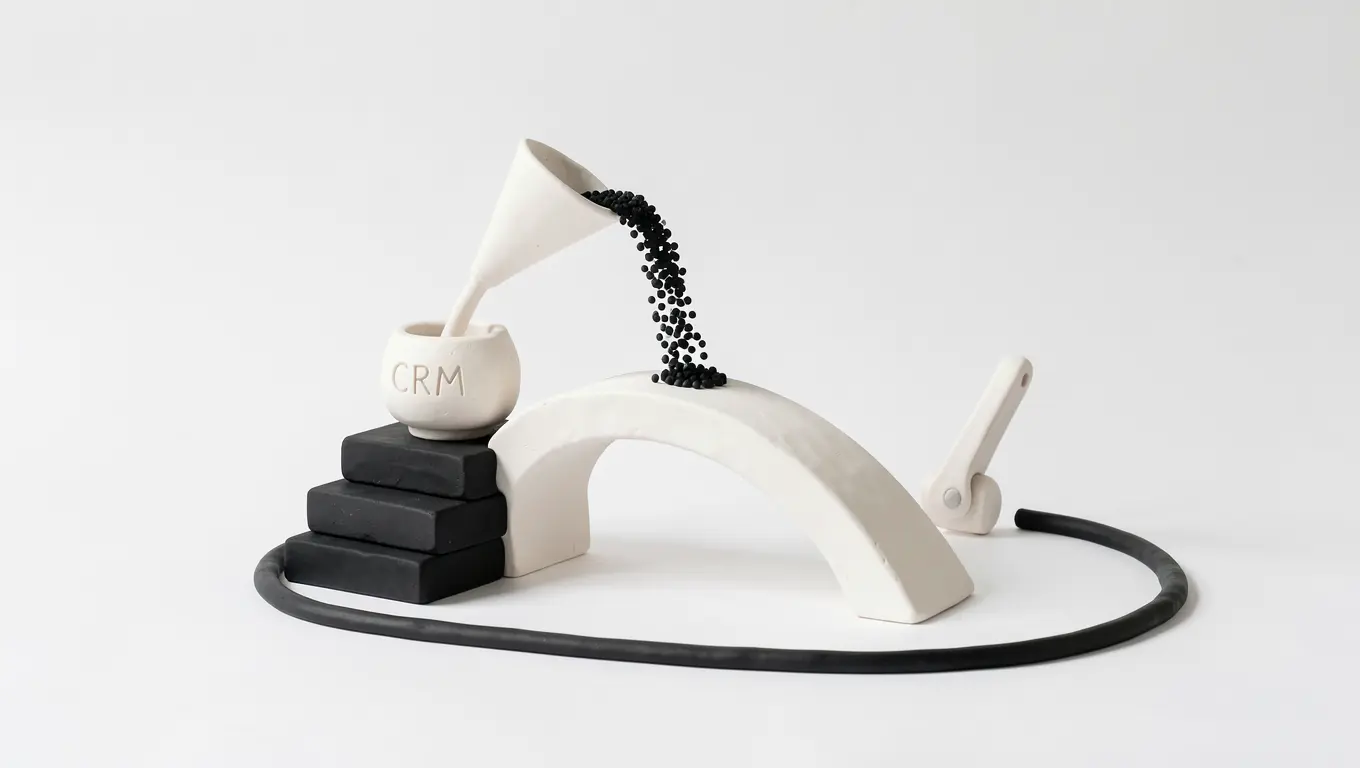
4. Integration gaps that force manual work
If the website feeds data into a spreadsheet or a CRM that requires manual entry, the system is fragile. A quick build might have skipped the step of connecting the form to the database, leaving the team to copy and paste information. Over time, this manual loop becomes a source of errors and frustration.
5. The design does not match the brand story
When the visual style of the site does not reflect the brand’s tone or values, visitors may feel a disconnect. A temporary design often prioritises speed over brand alignment, which can dilute the business’s identity and reduce trust.
How to move from a patch to a purpose‑built foundation
Start by mapping the core user journeys and the data that needs to flow between the website and the rest of the business. Then:
- Define a style guide that covers colours, typography and component behaviour.
- Write a content inventory that lists where each piece of copy lives and why.
- Build forms that capture only the information that the team will act on.
- Connect the website to the CRM or marketing stack so that data moves automatically.
- Review the brand story and ensure the visual language echoes it.
These steps turn a quick fix into a resilient system that grows with the business.
When you’re ready to rethink the structure
If your website feels more like a stop‑gap than a strategic asset, it may be time to pause and rebuild. A clear, purpose‑built foundation reduces friction, improves conversion and gives the team a reliable platform to work from.
For businesses that need a clearer structure, Nitio Design Studios can help create the brand, website and systems needed to support the next stage.
When a quick page turns into a permanent problem
After a client call you often need to send a link that explains the offer. A single page, a PDF, a slide deck – whatever is quickest to produce. Three months later that same page is still the only place people can find the service description, the pricing and the next step. It feels like a temporary fix that has become a permanent part of the business.
The temporary solution that stays
Founders love the speed of a one‑off page. It delivers a clear message, it can be shared instantly, and it satisfies the immediate need to move a conversation forward. The page is usually built in a design tool, exported to a CMS, and published. The work is done, the client is happy, and the founder can move on to the next task.
Why it becomes a friction point
When the page is the only place that holds the offer, the business starts to rely on it for every new enquiry, every sales call and every marketing touchpoint. If the page is not integrated with the rest of the website, the brand voice is inconsistent, the navigation is confusing and the data that should feed a CRM is missing. Over time, the page becomes a bottleneck: every time the offer changes, the page must be updated, the link shared again, and the team has to remember to keep it in sync with the rest of the site.
The invisible system that is missing
Behind a well‑structured website there is a system of content hierarchy, navigation, data capture and workflow. When a page is created in isolation, those invisible parts are not considered. The result is a visible surface that looks fine but is disconnected from the processes that keep the business running. The founder ends up doing manual follow‑ups, chasing down spreadsheets, and dealing with inconsistent branding.
How to bring the visible and invisible together
Start by mapping the journey that the page is meant to support. Ask:
- What information does a visitor need before they can request a quote?
- Which fields should be captured to trigger a follow‑up email?
- How does the content on the page link to the rest of the site?
Once the journey is clear, embed the page into the existing website structure. Use a content block that can be reused, link it from the main navigation, and connect the form to a CRM or an email‑automation tool. This turns a one‑off page into a component of a larger system that can evolve with the business.
Practical steps to realign
- Audit the current page against the site’s content strategy.
- Identify the data fields that should feed into the sales pipeline.
- Re‑create the page as a reusable component within the CMS.
- Set up a simple workflow that triggers a follow‑up when the form is submitted.
- Review the page quarterly to ensure it still matches the offer and the brand voice.
These steps keep the page useful, reduce manual work and ensure that the visible part of the business is supported by a reliable invisible system.
If your website no longer reflects how your business works, Nitio Design Studios can help you rethink the structure, design and systems behind it.
What Nitio Design Studios Does
We are a London‑based studio that partners with founders and growing businesses to lay the foundations that keep a company running smoothly. We look at what customers see and the hidden systems that keep those elements reliable.
Our Core Services
- Brand identity – the look, feel and tone that communicates who you are.
- Website design and development – a site that looks good, loads quickly and leads visitors to the next step.
- Content strategy – clear, useful copy that answers the questions your audience asks.
- Search optimisation – technical work that helps search engines recognise what you offer.
- Systems and workflows – tools and processes that cut manual work and keep data tidy.
- Product and prototype design – turning ideas into tangible, testable solutions.
- 3D and spatial visualisation – realistic representations of products or spaces for marketing or design.
Why We Take a Systems Approach
Every early decision – the colours you pick, the way you structure a form, the workflow you set up – becomes part of the architecture a business relies on later. If that architecture is fragile, the business will find it harder to grow or to bring new team members on board.
Our role is to make those early choices clear, intentional and scalable. We achieve this by:
- Observing how your brand, website and tools interact in real situations.
- Spotting hidden dependencies that could become bottlenecks.
- Designing solutions that are both visible – a clean interface – and invisible – robust data flows.
What We’re Not
We are not a generic design agency, a web developer, an SEO provider or an automation consultancy. We are not a one‑size‑fits‑all service that promises instant rankings or revenue jumps. We do not claim that design alone will solve every problem, nor that a system can replace a founder’s judgement.
Our Promise
We build foundations that are clear, useful and well‑made. We keep the work practical and grounded in the realities of running a business. We aim to help you see the structure behind the surface so you can make decisions that stand the test of time.
Who We Work With
We work with founders and teams in London and beyond who need a partner that understands both the creative and operational sides of a business. We collaborate closely, ensuring that every visual and technical choice supports the same underlying goals.
How We Work
Our process begins with a deep dive into your current brand, website and workflows. We then map the visible and invisible elements, spot gaps and propose solutions that fit your budget and timeline. Throughout, we keep the focus on what matters most to your customers and your team.
Getting Started
If you’re looking for a partner who can help you build a solid, scalable foundation, let’s talk about how we can support your next project.